
These maps show how ridiculously unequal Britain’s economy is
Britain is a rich country: this relaxed assumption about our place in the economic pecking order has helped fuel everything from Brexit to the complacency that led to Brexit.

Thing is, though, Britain is also, by European standards at least, both a big country and an unequal one. So while it contains some of the richest regions on the entire continent, it also contains some of the poorest in western Europe.
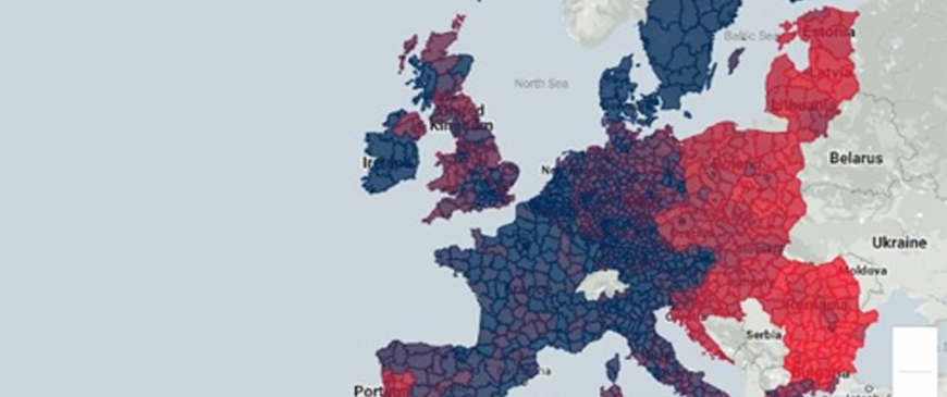
A new paper from the Centre for European Reform has quantified all this, which is exciting for us mainly because it includes an interactive map. Look:

The map, the authors write,
…illustrates Europe’s economic fault-lines. It shows regional productivity, measured by economic output per worker: the deeper the blue, the higher the region’s productivity as a percentage of the EU average, while the deeper the red, the lower.
It shows that many regions in richer countries are far less productive than the EU average, and some places in poorer countries are more productive than that average.
This is true – but it also highlights inequality in its different forms. Some countries are uncomplicatedly rich (Ireland, the Scandinavians) or poor (most of eastern Europe). But others are much more mixed. In Spain and Italy definitely have rich norths and poorer souths. With France and, especially, Germany, it’s hard even to spot a pattern. Although you’d expect the east of the latter to be poorer than the west, it’s surprisingly hard to see that on this map – an artefact, perhaps, of the fact those countries have been divided here into relatively small units.

And then there’s the UK, which is all over the shop.
For one thing, there’s Northern Ireland, where Belfast has an output per worker of 163 per cent of the European average, on a par with Denmark or the Republic of Ireland; but where the rest of the province is way below the European average.

The south east of England has some rich areas, which you’d expect. It also has some pretty poor, which you probably wouldn’t. On this measure, Central Hampshire has productivity at 115 per cent of the EU average, roughly on a par with Germany. South Hampshire, right next door, has productivity at just 88 per cent of the EU average – which is on a par with Greece.
It’s a similar story in the north, only this time instead of red bits on a blue background it’s rich blue bits surrounded by red. Liverpool has productivity of 114 per cent of the EU average (Germany again); across the Mersey on the Wirral it’s just 69 per cent (Solvenia). To the west, southern Manchester is pretty rich; northern Manchester eye-wateringly poor. Leeds is an island of prosperity surrounded by a struggling sea.

We probably shouldn’t over interpret this: at least part of the p attern is explained by the relatively small size of the units being analysed. London, for example, is split into well over a dozen of the things, with the top ranked (Westminster; 930 per cent of the EU average) being 13 times more productive than the bottom ranked (Redbridge & Waltham Forest; 72 per cent).

This presumably reflects that the former has a load of hedge funds and film companies working within its boundaries, while the latter is largely coffee shops and markets; but since some of the people who live in the latter work in well paid jobs in the former, it’s not an accurate reflection of how life in the two areas actually feels.
That said, productivity in Britain does seem to be both less equal and less evenly distributed than that in most European countries. Some areas really do look, economically, more like Greece than Germany. It’s hard to see this as a good thing.
Anyway, you can play with the full, interactive map here.